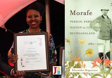
The JRB presents an excerpt from Publishing from the South: A Century of Wits University Press.
The book is available in open access format, and can be read or downloaded free of charge here.

Publishing from the South: A Century of Wits University Press
Edited by Sarah Nuttall and Isabel Hofmeyr
Wits University Press, 2024
~~~
Uncovered: One Hundred Years of Book Covers
Kirsten Perkins and Corina van der Spoel
The Early Beginnings
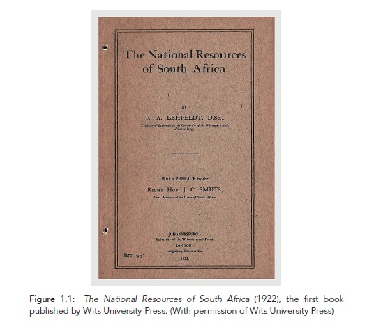
The first book to be published by the University of the Witwatersrand Press, now known as Wits University Press, was The National Resources of South Africa in 1922. It was a simply stapled volume with a brown paper cover, bearing only the title, author and contributor names printed in a straightforward way with a solid frame around them (figure 1.1). Written by Robert A. Lehfeldt, a professor of economics at Wits University, the book included a preface by Jan Smuts, then the prime minister of the Union of South Africa, in which he praised Lehfeldt for ‘undertaking the preliminary economic survey of this country’. This short book of seventy-nine pages established Wits Press with the founding of the University in 1922 and its links to capital, industry, mining and the state. The book’s publication was financed by the South African School of Mines and Technology, which, together with the Council of Education, Witwatersrand, Johannesburg, became the University of the Witwatersrand. The book spoke out against the inequities of the migrant labour system already prevalent on the mines at the time. The cover also shows that the publication was distributed in Johannesburg by the Press, and that Longmans, Green & Co., the joint publisher of the title, acted as the agent in the United Kingdom.1
Much has changed in the last one hundred years. In 2022 Wits Press celebrated a century of scholarly book publishing. The publishing team at the Press considered this milestone and long publishing history as the starting point to celebrate the oldest and still operating university press in South Africa. Cabinets in the Press offices stored an incomplete archive of publications from over the years that was largely ignored. (In fact, The National Resources of South Africa cannot be found in this archive and was sourced for this chapter from the National Agriculture Library in the United States.) Serious study of the archive had only been undertaken by a former publications officer of the Press, Margaret Anne Hutchings, and the book history scholar Elizabeth le Roux before any new interest in the archive was piqued with the upcoming centenary. The archive was intended to contain a copy of all books printed by the Press, a practice that continues today with each book that is produced, but some copies are missing. The archive has not yet been catalogued or organised.
Looking at this archive of copies in our offices, we were confronted with the material and physical nature of the books. The first and most clear-cut entryway into this silent bookshelf was to look closely at the front covers and book jackets, which allowed us to see how the Press’ book covers have developed and changed over the last one hundred years. We work in production and marketing as part of a small team to produce the Wits Press publishing list. As we are involved in the hands-on, day-today work of conceptualising cover ideas, commissioning designers, and selecting and finalising cover designs, we were intrigued by this archive and struck by how different the covers of older books are from the current cover designs we work on at the Press today. As the production editor, Kirsten Perkins commissions and briefs freelance designers on each book cover, with a clear direction from the publishing team and with input from the authors. These initial cover options are revised and refined before being finalised. Corina van der Spoel is the marketing coordinator and has a clear view of what the market, distributors and retailers expect and what will sell. This greatly influences the decisions that are made in-house when finalising book covers. Together, we manage the release of the covers into the market for advanced marketing ahead of publication.
Our study of the archive from our contemporary perspectives revealed a unique timeline of how book production and scholarly publishing has changed over one hundred years. It also revealed the Press’ relationship with its parent institution, who the intellectual elite in Johannesburg at the time were, the political and social context within which publishing occurred, research focuses of the University and how the publishing list changed over time. The front covers were an entry point into this history.
A book cover gives a visual representation of the text. Book covers aim to be easily comprehensible, attractive and informative. In the era of graphic design, which blossomed from the early 1950s, Marco Sonzogni outlines the two links that the cover makes: ‘the first, between the text and the cover; and the second, between the cover and the actual or potential reader’.2 Ultimately book covers are a marketing tool. They communicate brand and status, as well as serving to attract a potential reader to buy the book.
A book’s cover is a graphic representation not only of its topic but also of its viewpoint in history. Therefore, when we considered the book covers in the Press’ history, it was important not only to see the materiality of the printed books but also to consider their titles, the content they describe and the context within which they were published. We couldn’t simply judge the books by the look of their covers when to our eyes they also demonstrate so clearly how books were printed, bound and marketed, as well as the scope of the academic work being produced through the decades.
The simple paper cover of The National Resources of South Africa was an exception to the titles that would follow. Early covers were mainly red or blue cloth-bound hardbacks, with the title, author and university crest stamped in gold lettering. This followed what Percy Freer, the Wits University librarian and Press Publications Committee member, details in his book Bibliography and Modern Book Production. He describes the cloth-bound cover process and explains that this binding method was adopted because of ‘the demand for cheaper books and larger editions at the beginning of the last century’. Known as ‘casing’ or ‘edition binding’, it replaced leather covers.3
These simple yet sophisticated covers of this early period of the Press, each debossed with the university crest, demonstrate the close relationship between the Press and its parent institution. The Press played a significant role in establishing the young University as a serious educational and research centre by publishing the work of Wits academics. The University had transitioned from a mining school to a university by statute in 1922. This presented an opportunity for the new university in Johannesburg to demonstrate its legitimacy and cultural capital as an institution of learning that produced relevant research locally and nationally by establishing a publishing house. From the beginning, the Press’ mission was closely related to that of the University: ‘to produce original research and to contribute to a worldwide scholarly conversation’.4 Furthermore, the Press fulfilled ‘the need for local publication outlets for both emerging and internationally recognised researchers’.5 Wits publications were available in the United Kingdom through a distribution agreement.
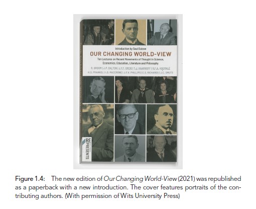
An early book, published in 1932, Our Changing World-View was part of a successful funding appeal to rebuild the University’s library after it burnt down in 1931. It also served as an occasion for Wits’ leading faculty members to position the University as an institution with a leadership role in public affairs and to show the transition from a mining school to a university. Above all, it was a means to project and position the University as a research as well as a teaching institution, led by a cohort of well-known liberal-minded intellectuals and leading academics of the time, including Jan Smuts, Ian D. MacCrone, John Young Thomson Greig and Reinhold Frederick Alfred Hoernlé.6 The first edition has a hardback cover in red cloth with gold-foil lettering under the simple white paper dust jacket, listing in plain typescript the names of the authors of the ten lectures (figure 1.2). Of course, the paradox of the title is immediately apparent. It is clear that the ‘our’ refers only to other white, liberal men who shared the same world view at the time. Similar cover treatment was given to Native Housing (1939) by P. H. Connell et al. in blue hardback (figure 1.3).
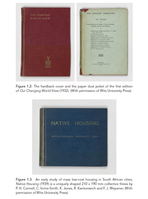
The reimagined cover of the 2021 edition of Our Changing World- View presents the photographic portraits of the contributors, which again highlights the fact that the book reflects the world view of liberal white men (figure 1.4). The cover design aimed to position the reissue for modern-day readers. The Press decided to brand the republication as ‘Wits Press Re/Presents’ by way of a logo that sets it apart from the Press’ other reprints. The book is essentially a time capsule, with much of the content demonstrating its historical provenance. The new introduction by the historian Saul Dubow emphasises this and frames the reissue in a contemporary context.
From December 1937, book covers as well as title pages featured the newly established imprint ‘Witwatersrand University Press, Johannesburg’ instead of only the university’s name, a move that established the Press as its own entity. That imprint is still used today.
Wrappers and Dust Jackets
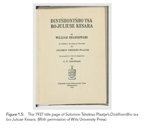
Early forerunners of dust jackets were not jackets but rather sheaths: a thin, transparent paper wrapper by which the publisher could protect the books in transit. This unprinted glassine dust wrapper allows what is inside or behind the paper to show through and was intended to be discarded on receiving or opening the book. For this reason these sheaths are now, more than a hundred years later, a rare find. One such find is the wrapper of a copy of Dintšhontšho tsa bo-Juliuse Kesara, Solomon Tshekiso Plaatje’s Setswana translation of William Shakespeare’s Julius Caesar (figure 1.5). It went to print five years after Plaatje’s death, in 1937, published as number 3 in the Bantu (later, African) Treasury series and edited by John David Rheinallt Jones and Clement M. Doke.
Interestingly, in later years protective wrapping was again used for Wits Press books – this time a modern version of protection, when the Press’ then US distributor, Transaction, advised in 2008 that books should be individually plastic-wrapped to ensure that they stay dust- and damage-free in transit from South Africa.
In the 1940s and up to the early 1950s, Wits University Press publications often had simple white dust jackets with minimal text, just enough to identify the volume. Generally, more conceptual design elements started to be used at this time as dust jackets became a standard part of the book’s appearance and marketing. Freer notes in 1954 that ‘booksjackets [sic] … first became common at the beginning of this [twentieth] century, [and] are often a sore point with the binder … They may be superseded by a suitable design on the boards.’7 The attractive jackets overtook the refined text- and letter-setting work binders did on the hardcover. However, for the most part dust jackets at the Press were simple – white with text – and used as disposable book protectors. The minimal use of illustration was meant to convey the seriousness of academic work and to avoid any commercial connotations. The loose paper jackets hid the rich, most often deep blue or red hardbacks (figures 1.6 and 1.7).


Exceptions to this binding method were lecture notes and field guides that were tape-bound or staple-bound paperbacks, reflecting the material demands of their use by students. Tape-bound, spiral-bound and staple-bound books are cheaper, lighter and impermanent, making them more suitable for how students and researchers use these texts (figures 1.8–1.10). Their small trim sizes allowed them to be convenient companions for student coursework.


The First Illustrated Cover
The cover illustration on the dust jacket of The Social System of the Zulus by Eileen Jensen Krige, published in 1936, is a notable exception to prior Press publications, which almost invariably had no cover illustrations. From the beginning, ethnographic studies was a very important subject area for the Press and was led by the research of the University departments, notably the Department of Bantu (African) Studies and the journal Bantu (later African) Studies. The ethnographic studies were generally illustrated with photographs of the subject of research. This pattern can be traced over the last one hundred years from The Social System of the Zulus (1936), The Musical Instruments of the Native Races of South Africa (1965), Boundaries and Belief (1981), The Social Organisation of the Nama (1985), Culture and the Commonplace (1997) to Healing the Exposed Being (2017) and many others in between.
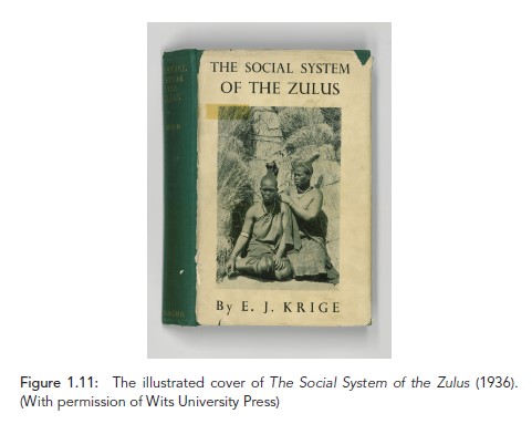
Krige’s The Social System of the Zulus is a plain, unprinted, green hardcover with a dust jacket illustrated with a black-and-white photo of two Zulu women with intricate hair knots; sheaves of cut and bound grass are stacked in the background (figure 1.11). Although the tradition of hair knots for women and their significance in the Zulu social hierarchy is extensively described in her book, Krige makes no reference to the cover photo or its provenance.8
The Social System of the Zulus is one of the first books by a woman author from the University of the Witwatersrand. Eileen Krige was a social anthropologist and one of the key figures (along with Hilda Kuper, Monica Wilson and Winifred Hoernlé) in the growing field of social anthropology. Her research was on the Zulu and Lovedu cultures. Certainly, the cover photograph is a descriptive illustration of societal traditions in Zulu culture at the time that the book covers. The reader is told in the preface that Krige collected a good deal of supplementary material from Zulu informants, and perhaps this photograph, presumably taken by her, illustrates two of them.
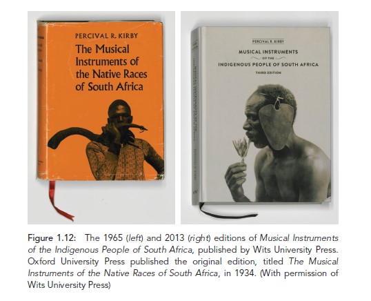
The first edition of Percival Kirby’s foundational text The Musical Instruments of the Native Races of South Africa was first published by Oxford University Press in 1934 and then by Wits Press in 1965. Kirby was a South African ethnomusicologist, and this book is the standard reference on indigenous South African musical instruments. The revised third edition published by the Press in 2013 has an updated title, replacing ‘Native Races’ with ‘Indigenous People of South Africa’ (figure 1.12). The Press often needs to consider the shifts in the political and cultural context when developing new editions. The new off-white hardback cover with no dust jacket uses a different photograph from Kirby’s collection, updating the edition with a modern high-resolution reproduction. The book also has a pagekeeping ribbon. Andrew Tracey’s book review highlights the new cover: ‘No need for a dust cover here – it would be a shame to shroud it! … But we still have the same unchanged information inside … Apart from its new and beautifully clear appearance it is no better or worse than the old one.’9 Indeed, it leaves Kirby’s original text unchanged. However, there are updates to the typesetting and written music, and new reproductions of the photographs. The book has been repackaged for a modern market.
Introducing Colour and Illustration
In the 1950s and 1960s, there was a prevalence of striking white dust jackets with text and a graphic image in one colour, red, especially for anthropology and sociology titles (figure 1.13). These then evolved to more conceptual designs that illustrated the content, such as the covers of Public Expenditure in South Africa and Teaching a Technology. Public Expenditure in South Africa (1964) is a conceptual cover depicting the geographic outline of the Republic of South Africa with the newly minted South African rand (ZAR) used as fill (figure 1.14). In 1961, when South Africa gained independence and became a republic, it adopted the rand as its currency, taking its name from the Witwatersrand where gold was discovered. The Press’ name appears on the front cover without a crest or logo.
A lithographic revolution in print in the 1960s and 1970s made it possible to include more creative and complex elements on book covers. Offset lithography overtook the traditional letterpress method and was capable of ‘producing high-quality, multi-colour print at high speeds’.10


We start to see more modern design concepts and striking black-andwhite conceptual designs for the covers. One such an example is the minimalist cover design of The Synthetic Vision of Walter Gropius by Gilbert Herbert (figure 1.15). Published in 1959 as a libellus (a little book, booklet or pamphlet), it contains Herbert’s essay on the architectural philosophy of Walter Gropius, the father of Bauhaus. The book features a foreword by Gropius. The minimalist cover, in a faded grey colour, shows a map of a contoured terrain that is superimposed onto concentric rectangles, reflecting Gropius’ philosophy and ideas around synthesis and order. This cover illustration was created by students of Gropius at the Department of Architecture at Harvard University.
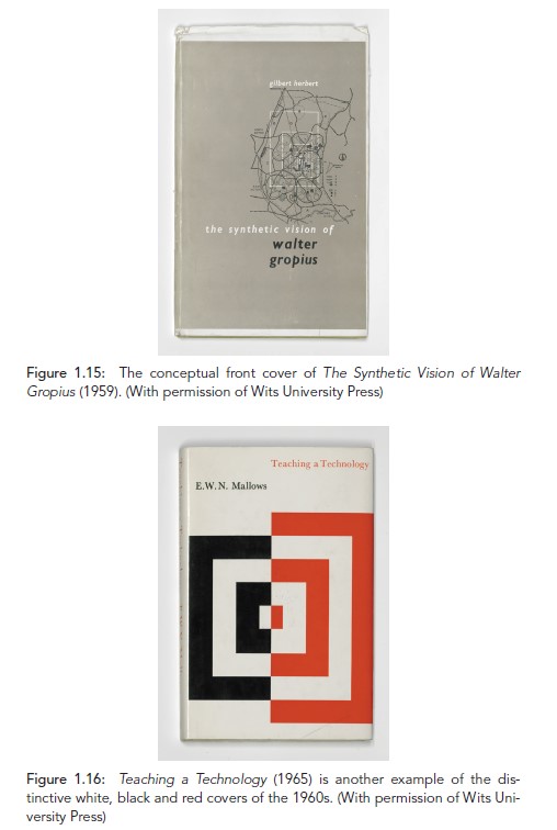
One of the very first clear modernist designs of a Wits University Press publication comes in 1965 with E. W. N. Mallows’ Teaching a Technology (figure 1.16). The dust jacket was designed by Peter Eliastam, who taught applied design at the Art School of the Pretoria College for Advanced Technical Education. Together with colleagues and artists such as Ernst de Jong, Zakkie Eloff and Robert Hodgins, Eliastam ‘sought to engage with the domestication of modernism in a peripheral, African community’.11
The cover design is so outstanding that it gets a mention in the Architectural Science Review: ‘The production of the book is a credit to the University of Witwatersrand Press. There is a striking dust-cover, a rarity among University-press books.’12 The dust jacket illustrates the divide, the author argues, between the humanities and the technologies. The Press hit a lull in output and revenue in the 1970s at the height of apartheid. The main source of income was the Bantu Treasury series, and the Press relied heavily on prescription in Bantu Education schools and struggled to remain financially stable. Even though ‘WUP began to use the crest of the University beside its name, as a colophon (a printer’s mark or logo)’ to emphasise the link between the two, the Press struggled for support from the University.13
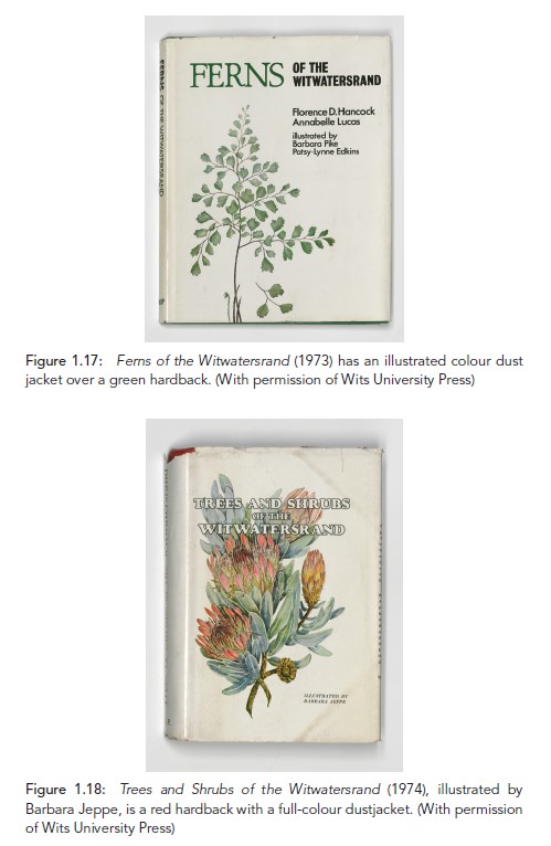
There was an interesting introduction of botanical books and natural science field guides to the publication list, such as Ferns of the Witwatersrand (1973), Trees and Shrubs of the Witwatersrand (1974), Important Plants of Sterkfontein (1975) and The Flora of the Witwatersrand (1987). Trees and Shrubs of the Witwatersrand includes a colour illustration by Barbara Jeppe on the cover, which matches the botanical style of illustration also featured on the earlier Ferns of the Witwatersrand (figures 1.17–1.19). The Flora of the Witwatersrand, on the other hand, has a botanical cover illustration in black and is a ‘handy pocket book with rounded corners. A book with general audience appeal, likely a field guide that sold well and helped fund (cross-subsidised) other works.’14 Le Roux argues that ‘the list of the 1980s is dominated by service publications, such as catalogues, inaugural lectures, conference proceedings and publications by the various research institutes’,15 meaning that the Press remained a strong service publisher for the University. However, the Publications Committee was pushing for a more commercial approach to what the Press published at the time.

Le Roux explains that ‘there was a feeling that service to the University had been overemphasised and that this policy should be replaced with an aggressive and competitive policy of more commercial publishing’.16 Despite this push, not much changed in the list.
The Commercial Marketplace
A big leap is seen in the materiality of the covers in the 1990s. Design in the digital age with the advent of desktop publishing (DTP) allowed for enhanced visual communication with more sophisticated graphic design as well as streamlined production processes and proofing times. DTP innovations included the ability to use different fonts, colours, styles and graphics to create more attractive and diverse layouts. Another innovation was the integration of text and images, which enabled the combining of words and pictures in creative and expressive ways for cover design. Digital printing was also introduced and the technology developed rapidly.
The covers at the Press suddenly feature more colour and their titles are bigger and bolder. This was no accident. In 1989 the Press appointed a new head, Eve Gray. The Publications Committee’s recommendations from 1987 that the Press take a more commercial direction than before and accept external authors were also finally taken forward.17 Gray came with some publishing experience and brought with her an understanding of publishing operations. The covers started to be more commercially attractive, and the list expanded into other subject areas, such as popular science (figures 1.20–1.22). Gray professionalised the department and established a network for co-publications with international publishers.


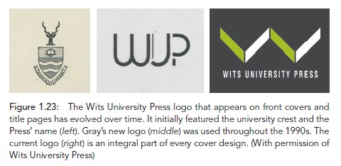
An important addition was a new logo commissioned in 1990 to show the new commercial direction. Replacing the university crest that had previously appeared as the logo, it was ‘a curved, more artistic representation of the initials of WUP’.18 The logo helped establish the Press as a commercial venture with a more public and separate identity. The new branding was also an integral part of cover designs and the logo appeared on the spines of books. The Press was renamed Wits University Press in the 2000s and ‘the current colophon represents a stylised W, which is reminiscent of the shape of two open books’ (figure 1.23).19
A good example of the possibilities of DTP is the cover of Sleep for Sale (1991), a study of shift work in South Africa. It features a black-andwhite photograph of a female worker perched on a boardroom table, polishing it. This image is repeated in a receding pattern in an emulation of shift and repetitive work (figure 1.24). A sticker added later on the back cover acknowledges ‘Photo by Lesley Lawson’. It is notable that the creators of photographs and artwork are increasingly acknowledged at this time.

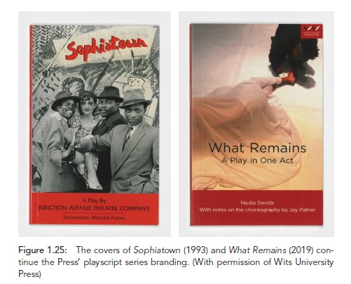
The 1990s saw the beginning of the playscript list for the Press that became commercially successful through school subscriptions.20 A key playscript was Sophiatown (1993), a workshopped play by the Junction Avenue Theatre Company. Sophiatown was selected for school subscription and has remained a best-seller for the Press ever since. The book cover features a photograph from the production and includes a distinctive red band across the bottom. This cover concept was picked up in the 2010s from various similar play covers published in the 1990s and was carried through as a brand for the Wits Press theatre list. The series brand differentiated the plays from the scholarly titles and created a unique identity for the plays (figure 1.25).
The New Millennium and Digital Publishing
The aim to give book covers a more general appeal continued in the 2000s. The use of contemporary art, photography, typography, composite images, stock images and original illustrations occurred more frequently, with softcover books being the preferred format. Add-on features such as flaps on covers were used for heavier books and to give titles a special look and feel. Matte laminate stock was preferred over the gloss laminate that was used in the 1990s and early 2000s. Books were thread-sewn for the stronger binding required for scholarly books that would be used and studied while lying flat.
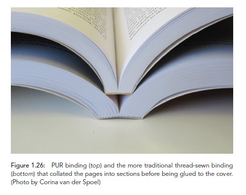
More recently, polyurethane reactive (PUR) adhesive binding is used in what Freer disparagingly refers to in 1954 as the new ‘unsewn’ method: ‘The back edges of the sheets are cut, or sanded off, and the edges are bound together by means of a plastic covering.’21 This binding method was being used for telephone directories and cheaper editions and novels at the time, and was probably considered unsuitable for library editions and scholarly books. Now, however, PUR binding is the preferred method, given the improved quality and durability of the glue used to bind pages (figure 1.26).
The evolution of cover designs from the 2000s through to the 2020s does not illustrate significant advances in technology but shows a wider variety of cover composition, artistic variety and typography. Designers can draw from the full range of digital stock imagery, photography and artwork through easy access to online content.
Fine art for book covers
The use of existing artwork such as paintings, sculpture, prints, linocuts and sketches for covers is a significant new direction that is seen from the 1990s but especially in the 2010s. The searchability and discoverability of more artists’ collections and exhibitions available online has deeply enriched cover designs. Fine art can be used to illustrate elements of the book’s content and as a way to connect that content with an audience often more successfully than a very literal photograph can, especially in the subject area of literary studies. In many instances artwork is able to depict, develop and convey content in a different and more interpretive way. South African artists such as Penny Siopis, Irma Stern, Gerhard Marx, Mohau Modisakeng and Blessing Ngobeni have been featured on Press covers (figure 1.27).

Typeface to create meaning
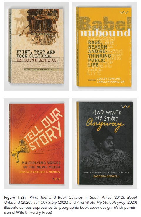
Another striking development is the creative use of typefaces in cover designs at this time (figure 1.28). Typefaces are used to convey the tone and content of books, especially in the fields of politics and literature. Typography becomes very important as key imagery itself and in generating meaning through type. For example, by layering words and building words from words themselves, the cover of Babel Unbound speaks to the many voices and the concept of babelisation in the public sphere that the edited volume addresses. As another example, Tell Our Story’s main title text takes up the shouting voice of the megaphone, which cites the voices of protest as well as the voices of communities that take civil action – voices that are often ignored by news media. The cover of Print, Text and Book Cultures in South Africa references in the main title the typewriter and block letters used in early word-processing. This mirrors the two artworks by Willem Boshoff that are combined for the cover: Death of a Typewriter (1978) and Abamfusa Lawula (1997). On the cover for And Wrote My Story Anyway, simple handwriting for the title quickly communicates the subject matter and, paired with the title, complicates the act of writing that black South African women experienced during apartheid. ‘Anyway’ in a different colour, yellow, indicates the defiance that the act of writing required of them and hints at the main feminist themes that are explored in the book.
Typefaces are an efficient way to reference tone and context for the reader and immediately create meaning. Creative typography is often used for books where the subject matter is difficult to illustrate more literally.
Digital distribution and book covers
Cover design has taken on additional use and impact as the Press’ brand and reach has grown to distribution in North America, Europe and the rest of the world. With the advent of digital-led publishing, early and initial marketing of publications to aggregators (who collate and distribute marketing information from publishers to digital retailers), distributors and booksellers becomes essential, making impactful cover design even more important. Furthermore, print books have been supplemented by various digital e-book formats. In the digital book world, covers sometimes take up the most amount of space on a web page, or are all that is communicated about a book on a selling platform before a potential reader must click through for more information. The cover is a product description and marketing tool in one. A cover’s impact may well hold even more sway in the digital medium than in its printed, physical form. The physical materiality of scholarly books in the digital publishing era has diminished somewhat, with some books not being printed and only being published in digital formats – a new materiality for the reader.
Conclusion
Delving into the archive has illustrated the great transformations the Press has undergone in its long history as it has evolved according to changing demands, styles and research. Beginning with Wits University–based authors and research fields, and progressing to a global audience and authorship, the archive offers an overview of the Press and its activities. The Press itself developed with the young University from a service publisher into a leading global South scholarly press. The archive also reflects the growth of scholarly book publishing in South Africa as well as the change in focus to the humanities and social sciences. Evolving cover designs are visible markers of the Press’ responses to changing pressures and contexts throughout its history. They demonstrate the Press’ ability to keep adapting to the demands of scholarly publishing from Africa for the world.
NOTES
1 Margaret Anne Hutchings, ‘Witwatersrand University Press: 1922–1969. Compiled from Minutes and Files’ (unpublished manuscript, 1980–1984), typescript, part 1b, 4.
2 Marco Sonzogni, Re-Covered Rose: A Case Study in Book Cover Design as Intersemiotic Translation (Amsterdam: John Benjamins, 2011), 4.
3 Percy Freer, Bibliography and Modern Book Production (Johannesburg: Wits University Press, 1954), 239.
4 Elizabeth le Roux, A Social History of the University Presses in Apartheid South Africa: Between Complicity and Resistance (Leiden: Brill, 2016), 51.
5 Le Roux, Social History, 76.
6 Saul Dubow, ‘Introduction’, in Our Changing World-View, ed. Jan Christian Smuts et al. (Johannesburg: Wits University Press, 2021), xiv.
7 Freer, Bibliography, 248.
8 Eileen Jensen Krige, The Social System of the Zulus (Johannesburg: Wits University Press, 1936), 118.
9 Andrew Tracey, ‘Musical Instruments of the Indigenous People of South Africa. Percival R. Kirby. 2013. (1st ed. OUP 1934, repr. 1953, 2nd ed. Wits University Press 1965), 3rd ed. Witwatersrand University Press (title updated from “native races”) 159 ills., map, xxxv, 400pp’, African Music: Journal of the International Library of African Music 9, no. 4 (2014): 146.
10 Jo Francis, ‘Technology: Second Litho Revolution Puts Offset Back in the Spotlight’, Printweek, 9 March 2011, accessed 14 June 2024, https://www.printweek.com/features/ article/technology-second-litho-revolution-puts-offset-back-in-the-spotlight.
11 Eugene Hon, ‘Helen de Leeuw and Ernst de Jong: Shaping Modernity in Mid- Twentieth Century South Africa’, FADA Gallery (blog), 18 July 2017, http:// fadagallery.blogspot.com/2017/07/.
12 Anon., ‘Reviews’, Architectural Science Review 9, no. 4 (1966): 142, https://doi.org/10. 1080/00038628.1966.9696195.
13 Le Roux, Social History, 185.
14 Le Roux, Social History, 191.
15 Le Roux, Social History, 191.
16 Le Roux, Social History, 190.
17 Le Roux, Social History, 192.
18 Le Roux, Social History, 193.
19 Le Roux, Social History, 193.
20 Pat Tucker, interview by Kirsten Perkins and Corina van der Spoel, 18 July 2022.
21 Freer, Bibliography, 242.


